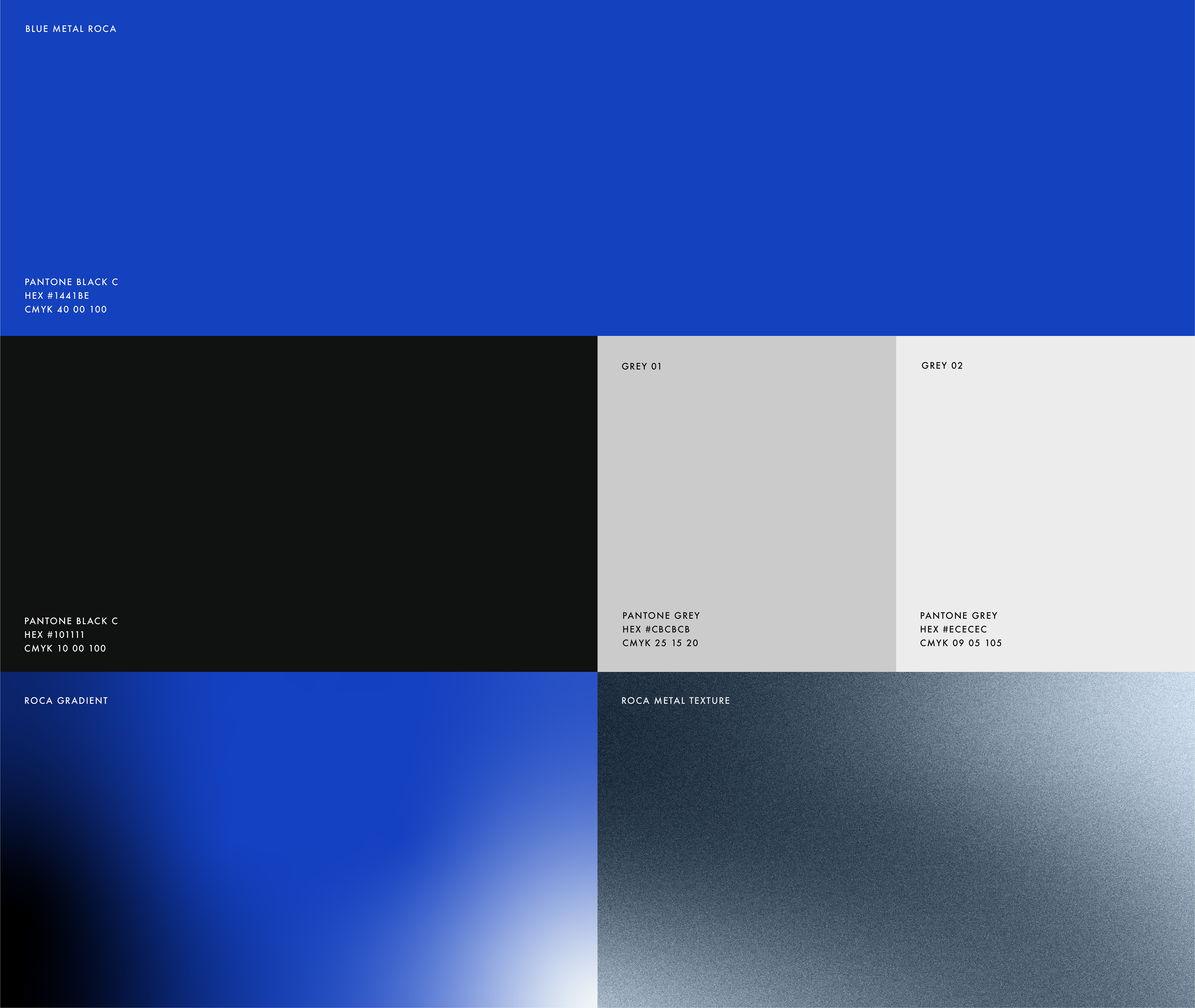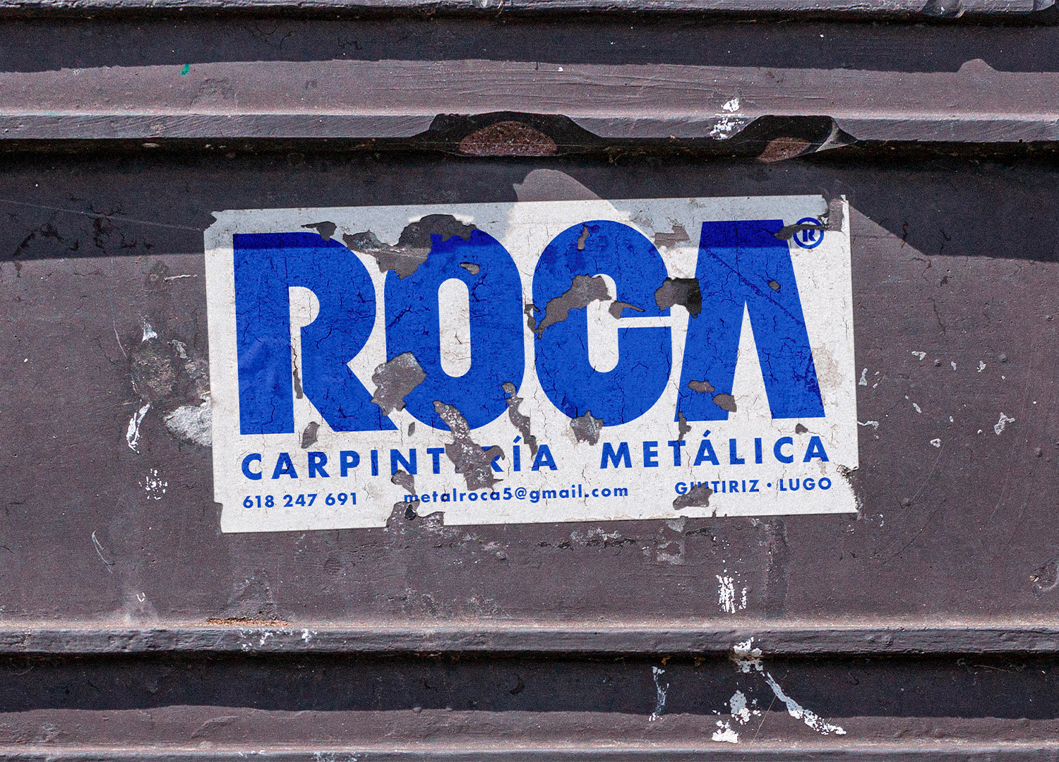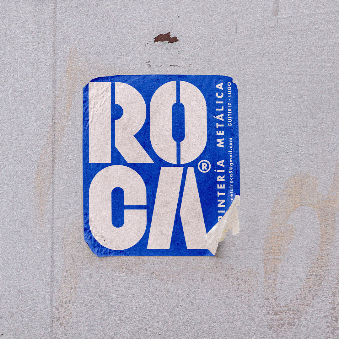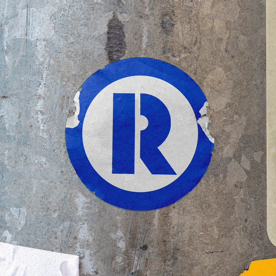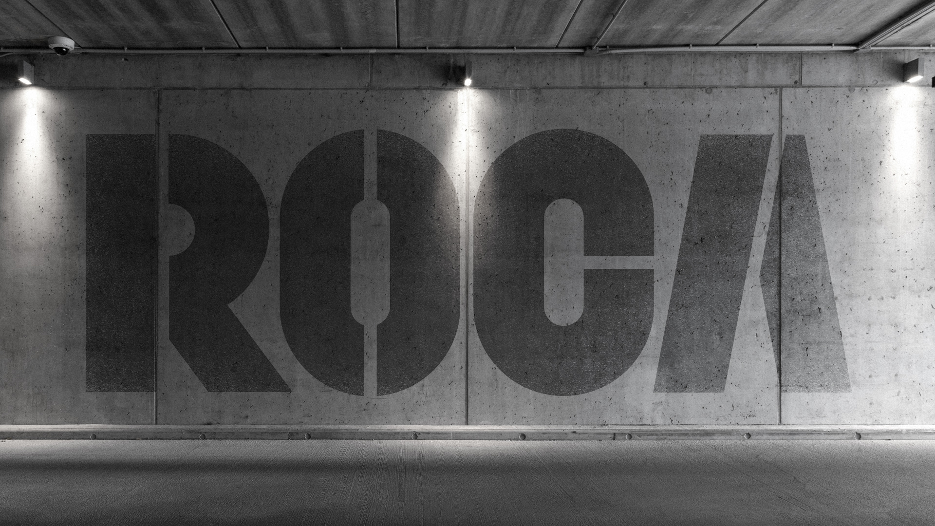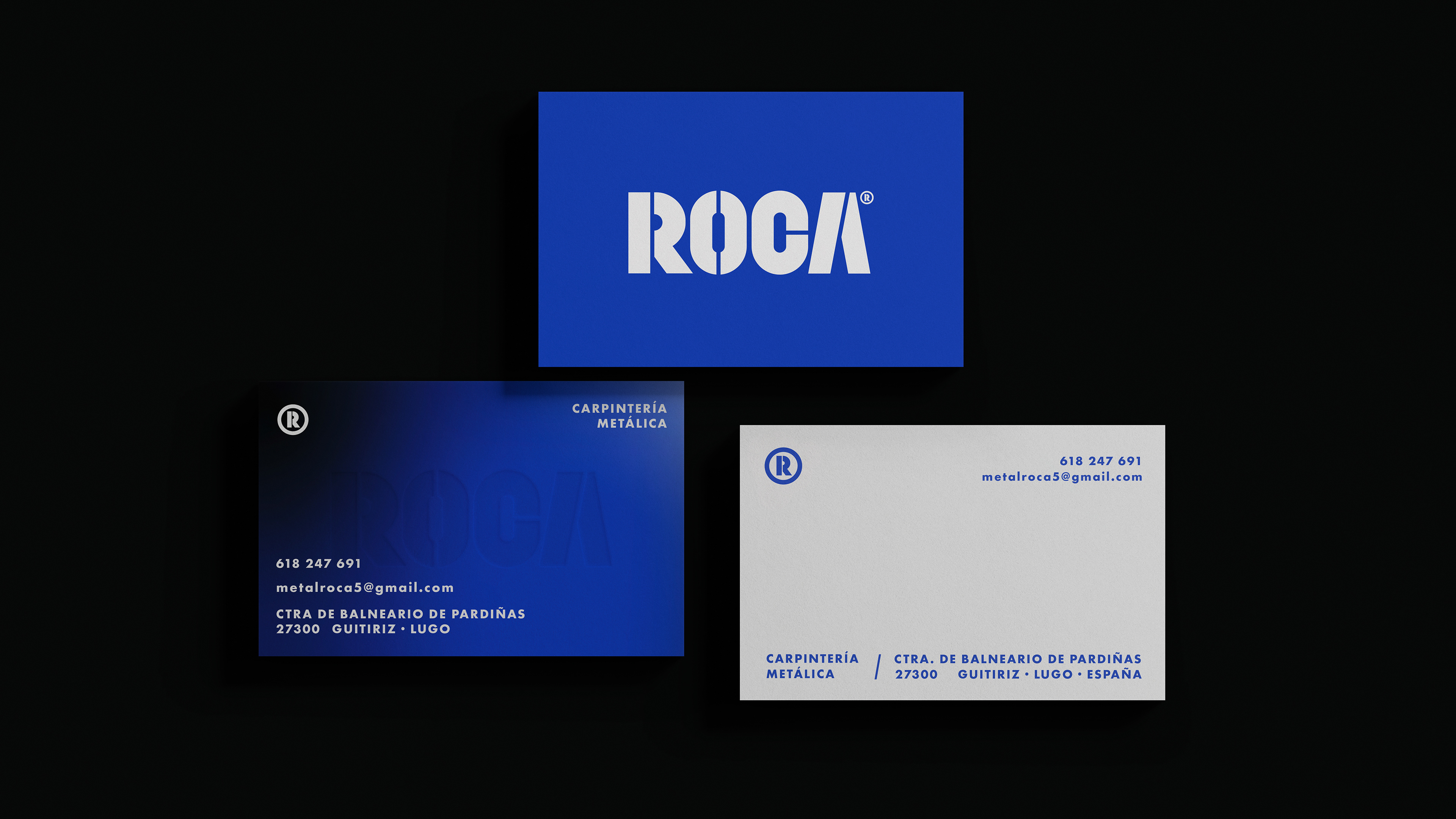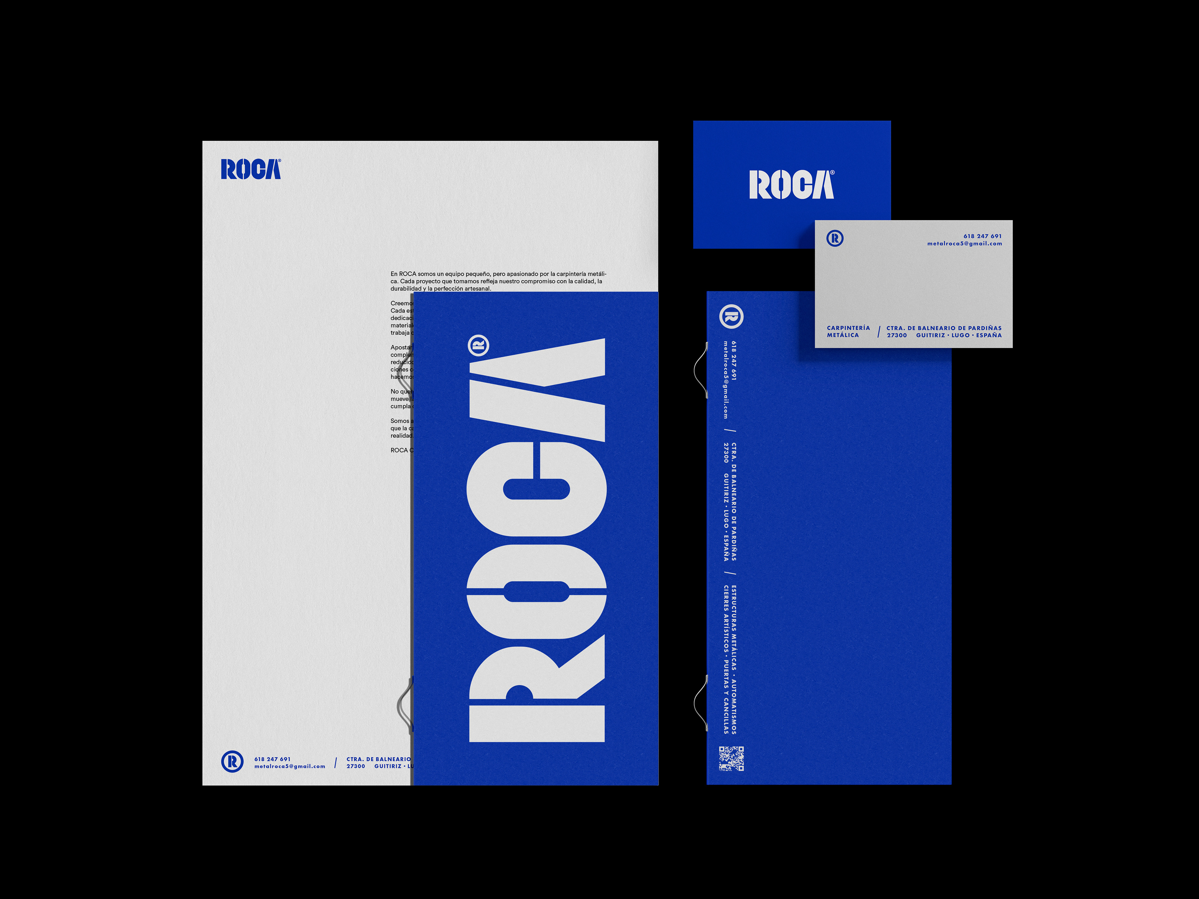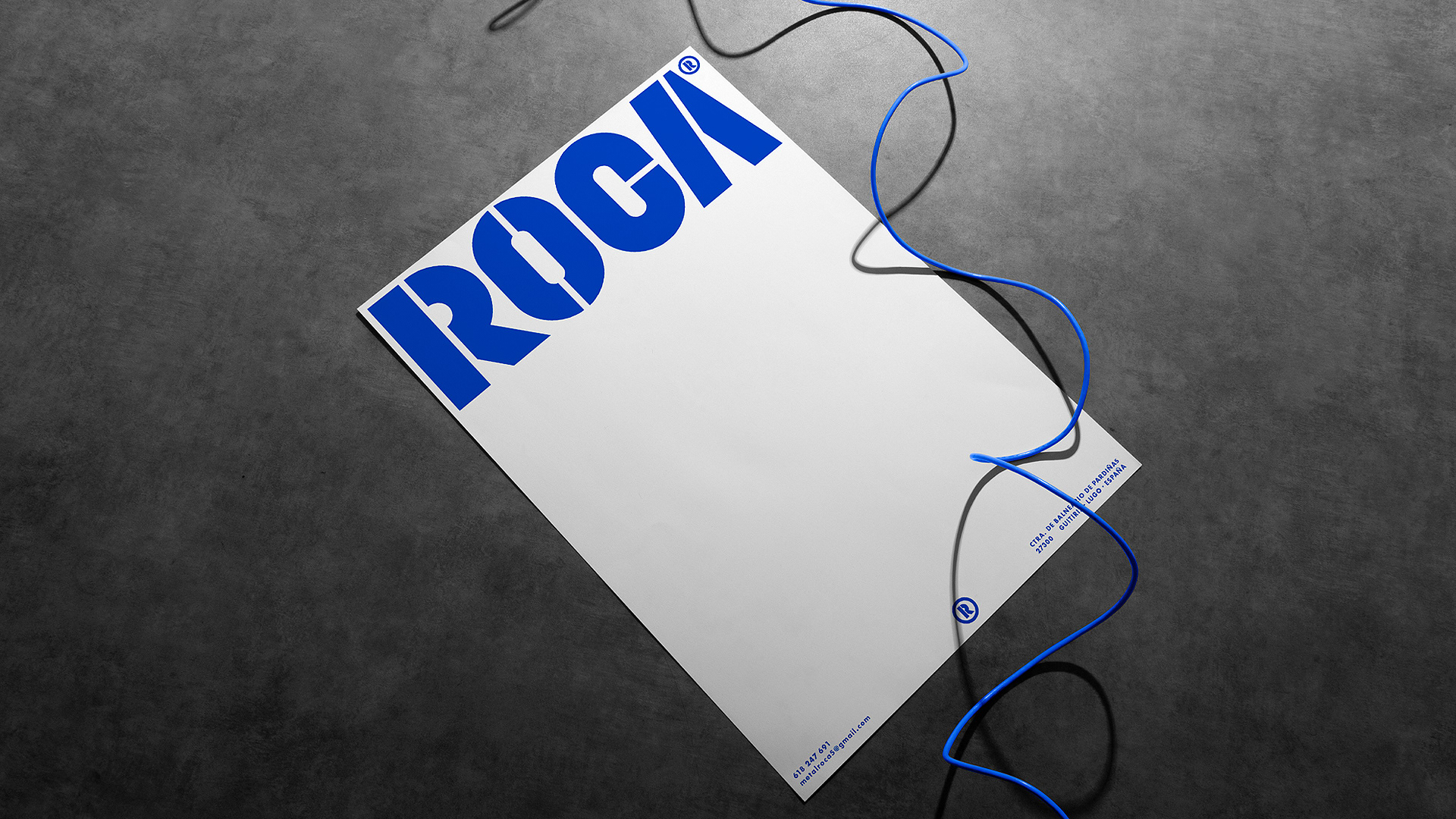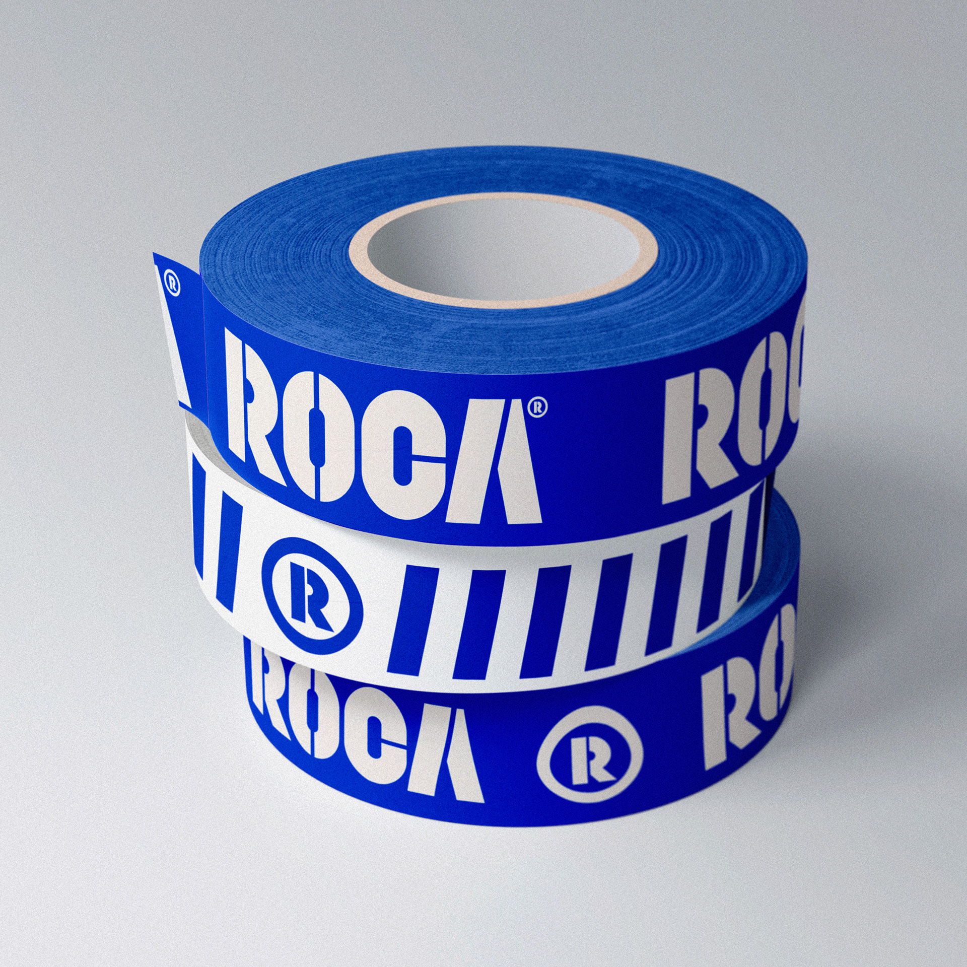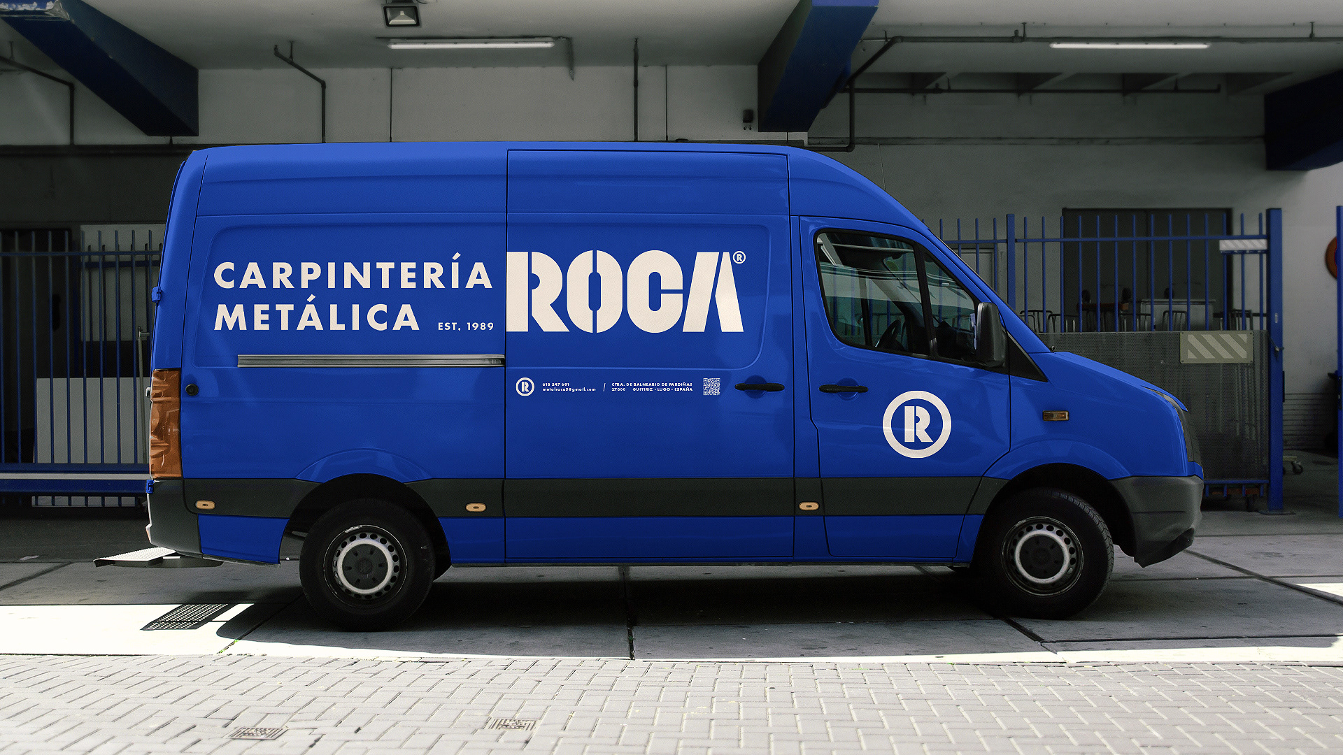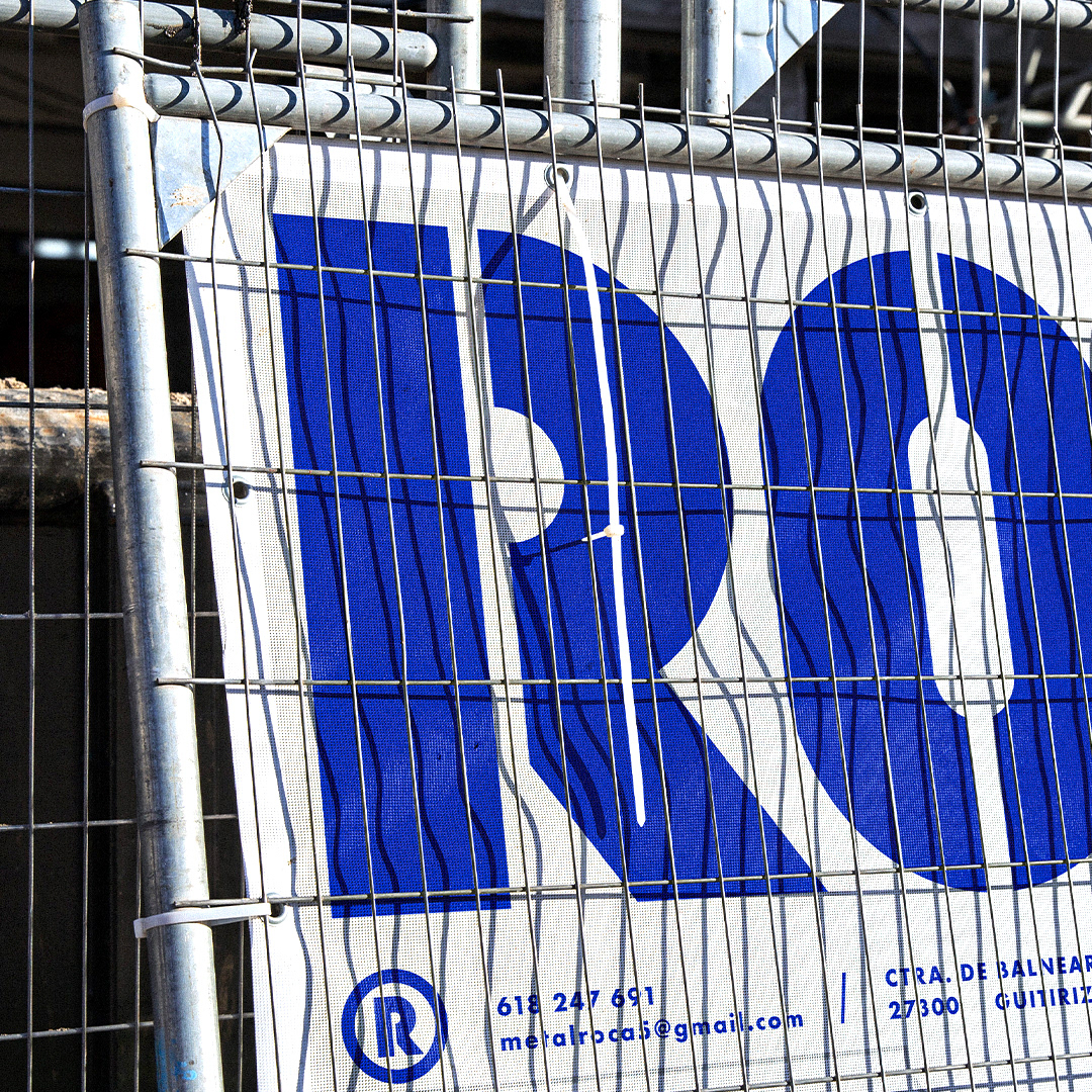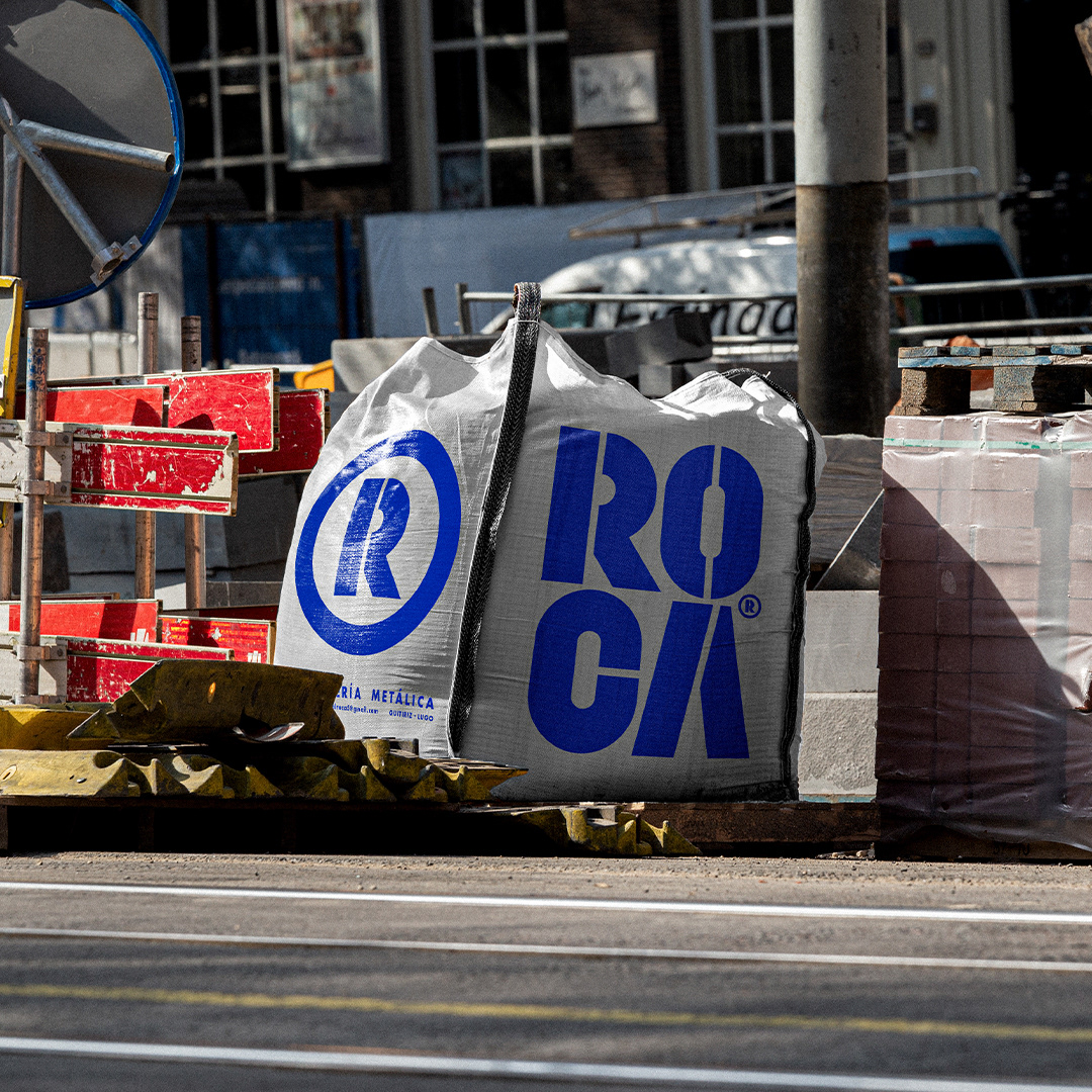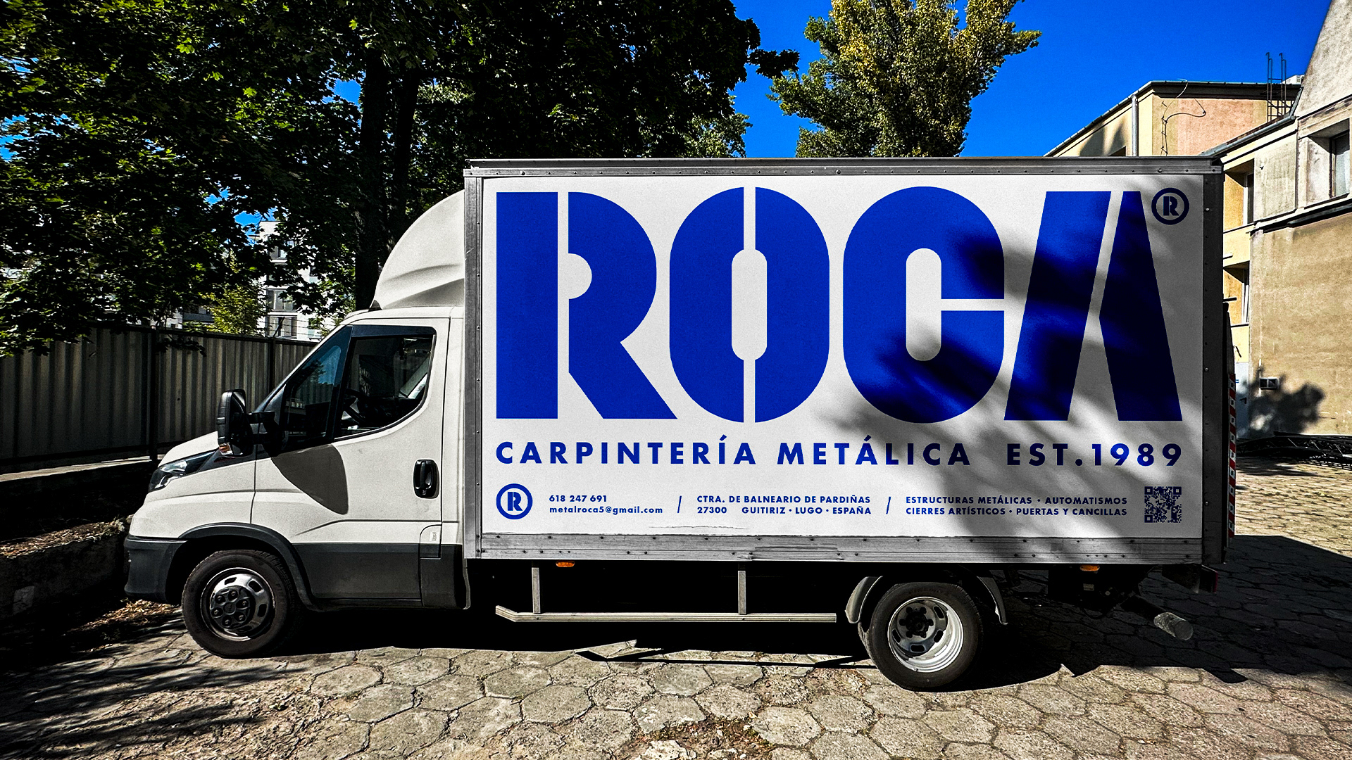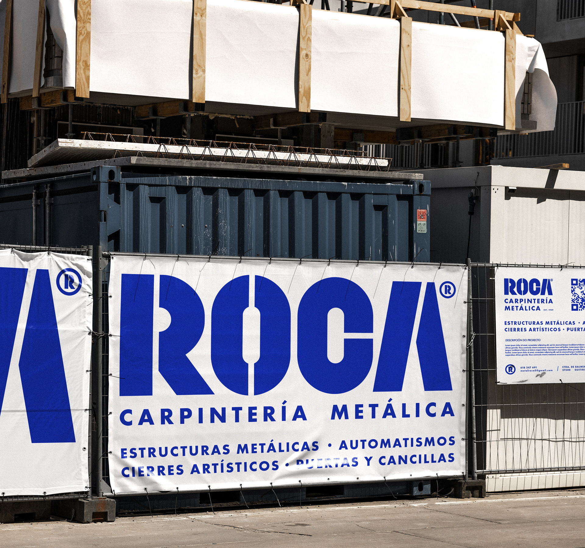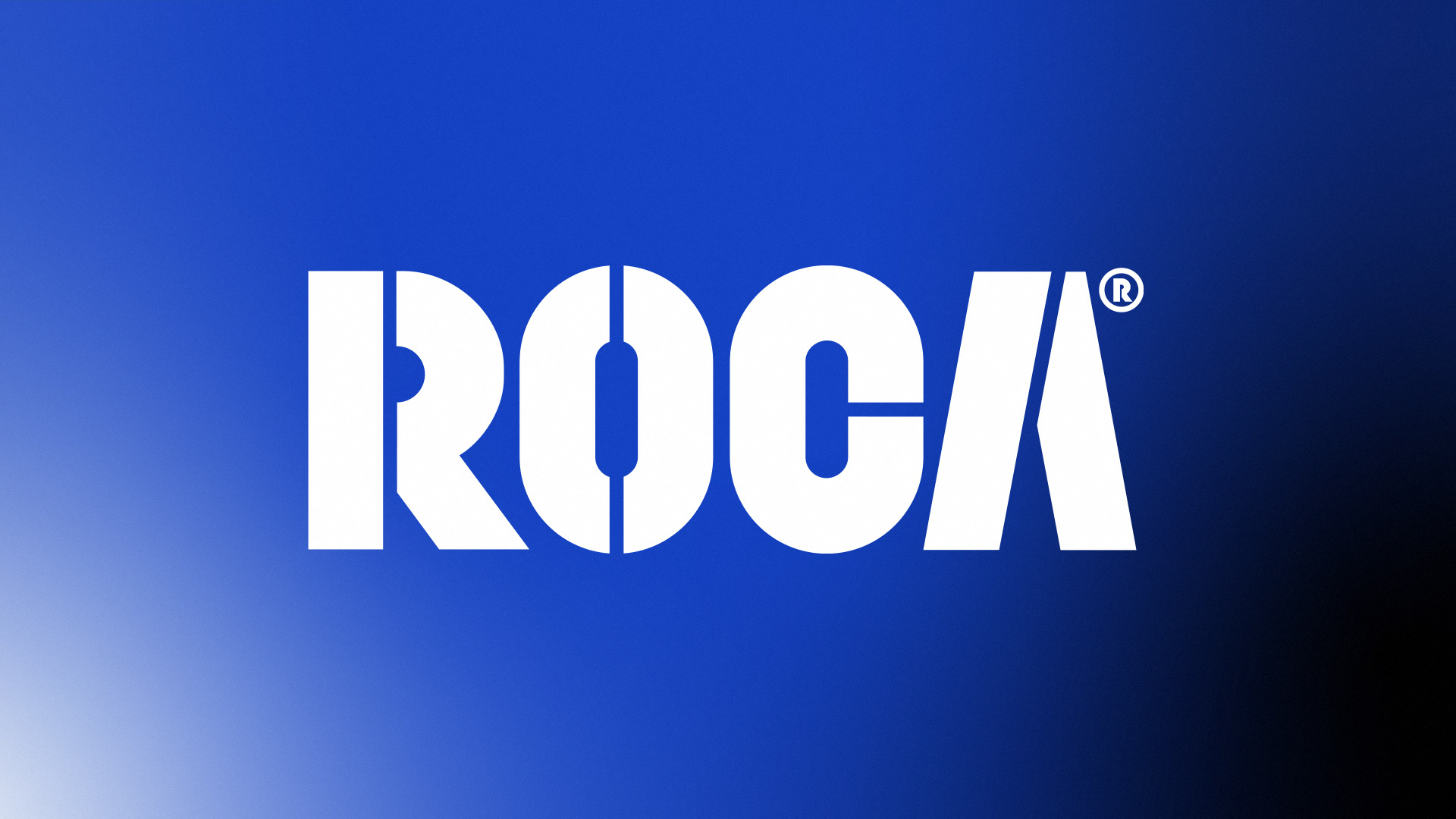
En este proyecto de branding para ROCA®, una empresa especializada en carpintería metálica, se ha destacado la solidez y durabilidad que caracterizan sus construcciones. El color azul eléctrico, combinado con degradados metálicos, evoca de manera sutil los materiales que emplean, transmitiendo confianza, profesionalismo y una conexión directa con el acero y el metal.
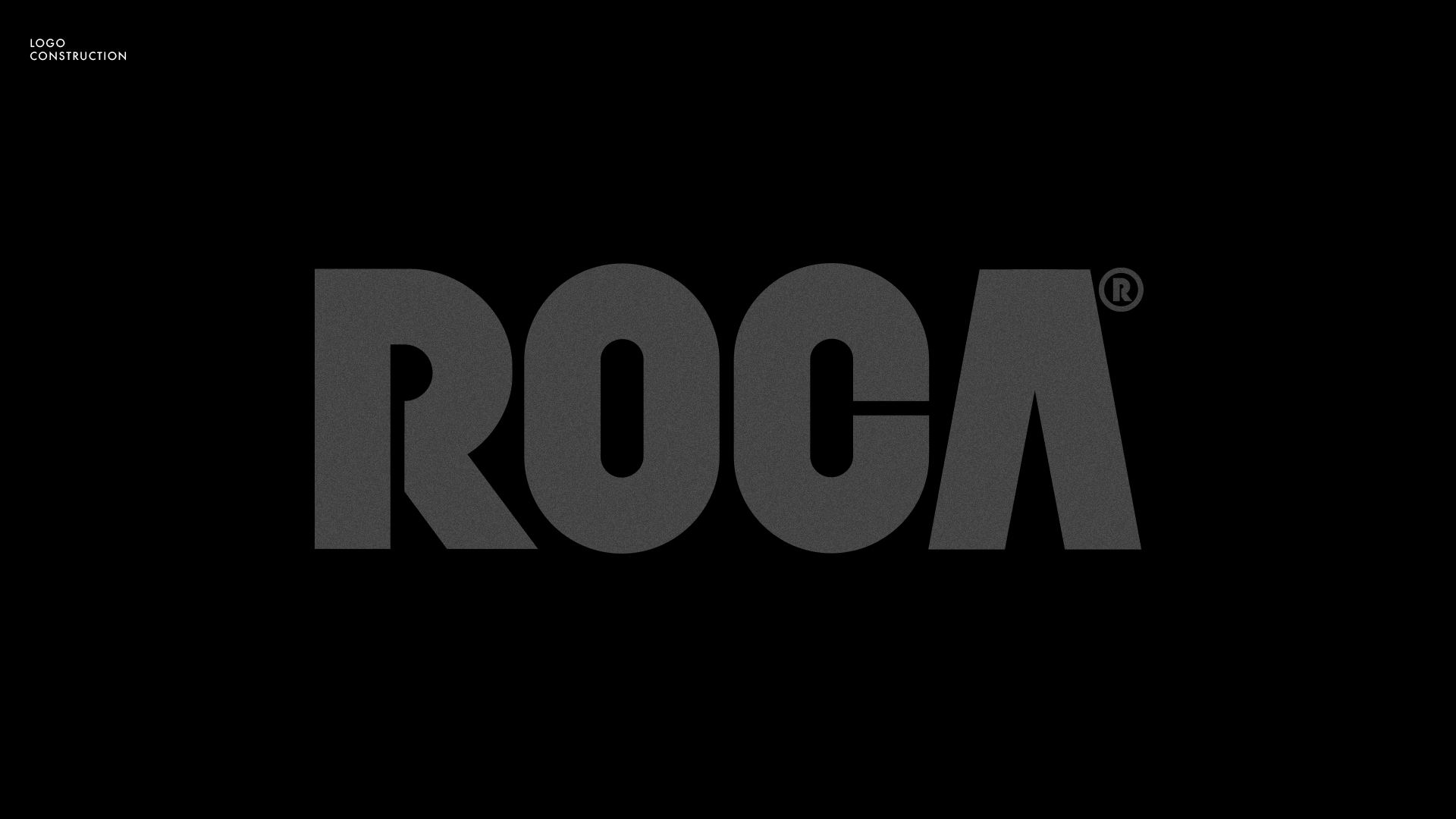
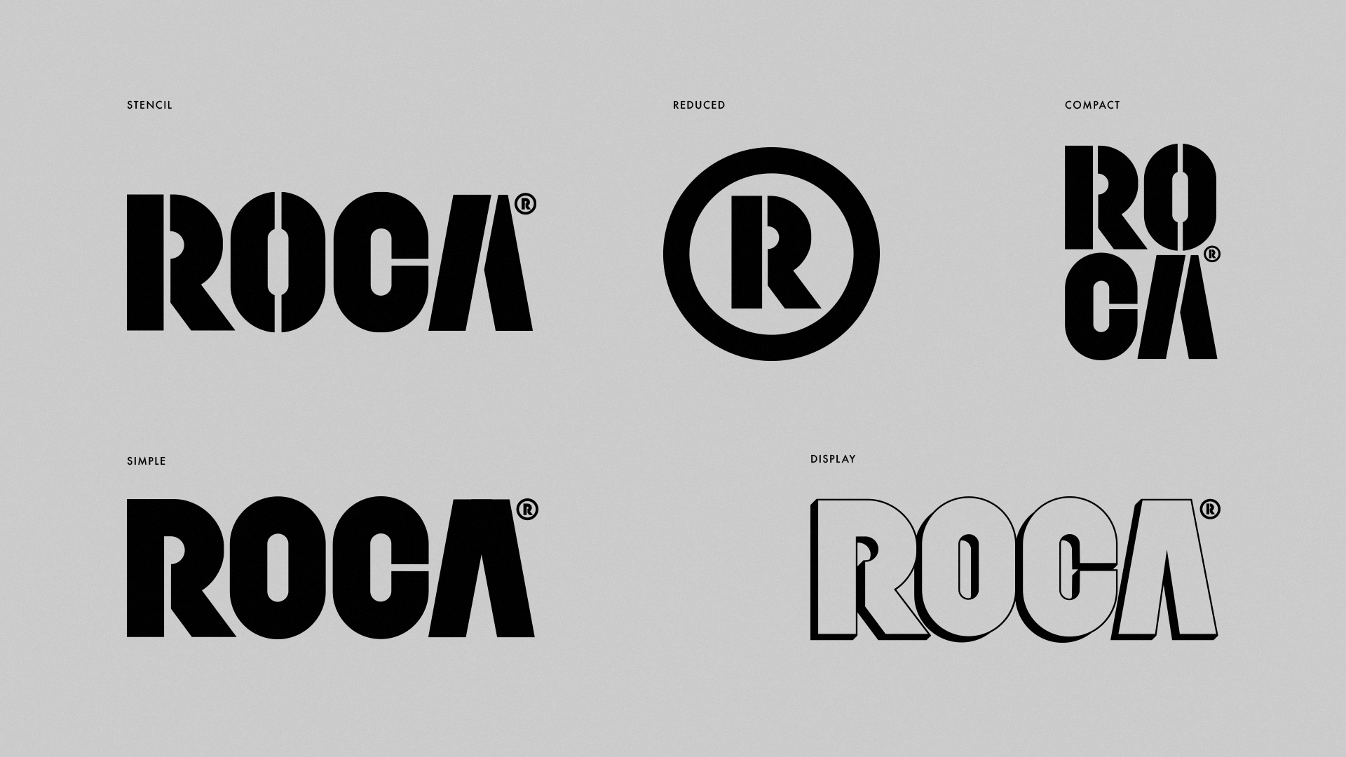
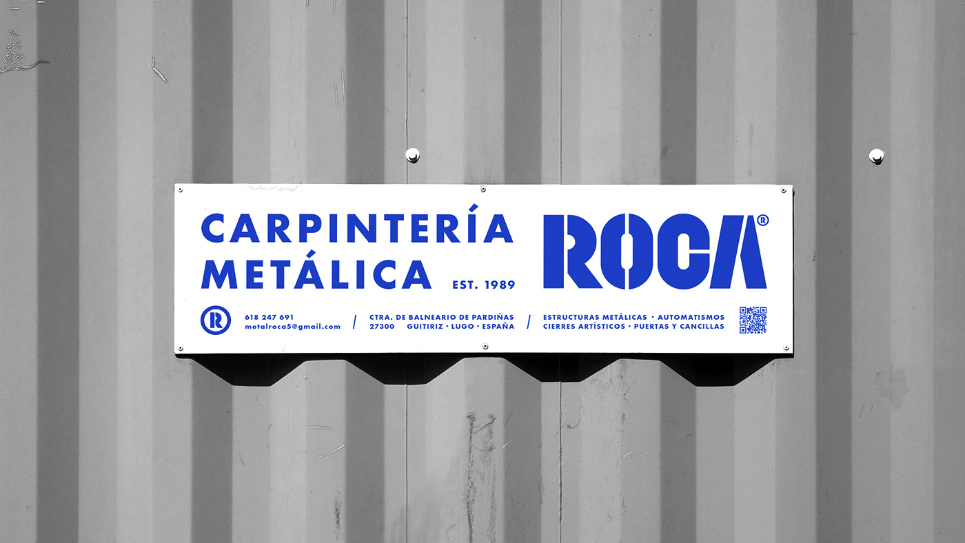
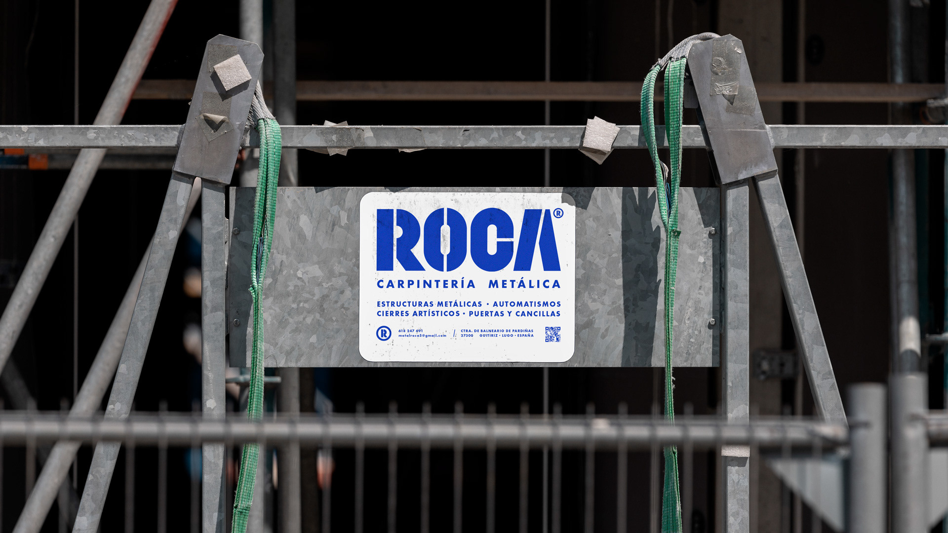
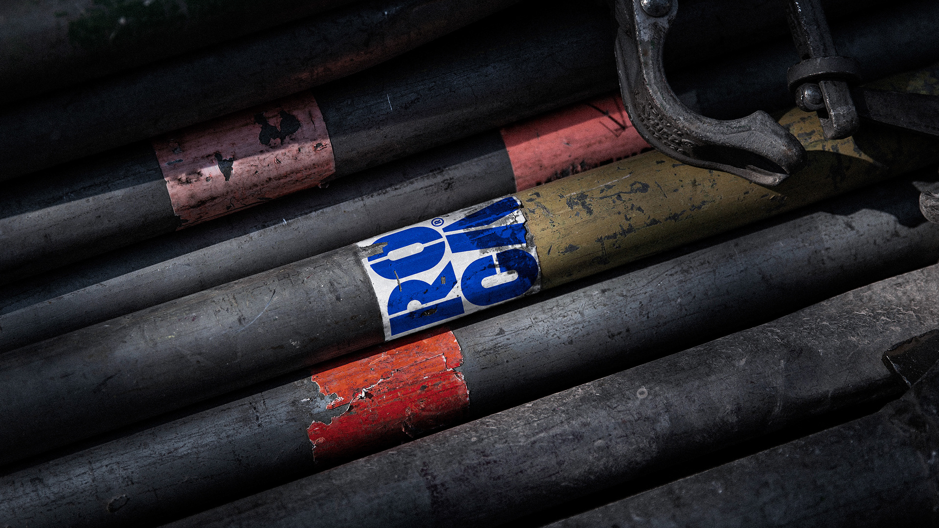
El logotipo, diseñado con una tipografía estilo stencil, refuerza su identidad sólida y reconocible. Este recurso tipográfico no solo comunica firmeza, sino que también se utiliza como base para crear formas y elementos visuales que refuerzan la identidad de la marca, logrando un sistema visual cohesivo y memorable.
In this branding project for ROCA®, a company specialized in metal carpentry, the emphasis is placed on the robustness and durability that define their constructions. The electric blue color, combined with metallic gradients, subtly evokes the materials they use, conveying trust, professionalism, and a direct connection to steel and metal.
The logo, designed with a stencil-style typography, reinforces its solid and recognizable identity. This typographic choice not only communicates strength but also serves as the foundation for creating shapes and visual elements that enhance the brand’s identity, resulting in a cohesive and memorable visual system.