
Objectives
Our main goal is to redefine how RESA connects with its audiences. This includes creating closer verbal and visual communication, unique storytelling, and an emotionally resonant identity. By doing so, we aim to optimize the user experience and improve business outcomes.
Creative Idea & Storytelling
University life represents a time of change and mixed emotions. RESA is more than just a residence—it’s a safe place to grow as a person and be part of a community. This concept is the guiding principle behind the entire project.
We adopted a first-person voice to build an authentic connection with the user. The messages are clear, emotional, and direct, always with a clever twist that invites engagement. This approach aims to foster a friendly, conversational relationship while moving away from traditional corporate communication.
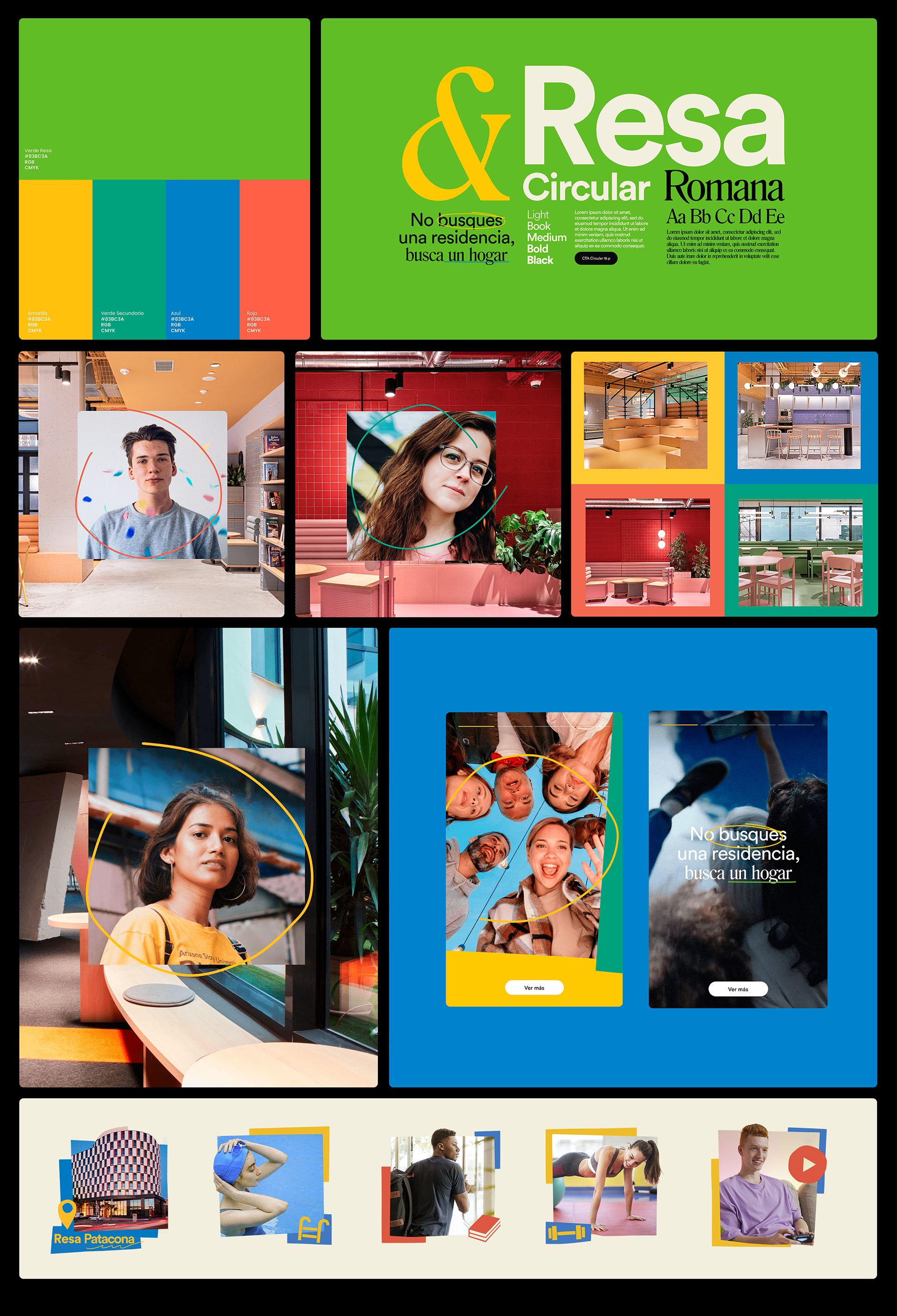
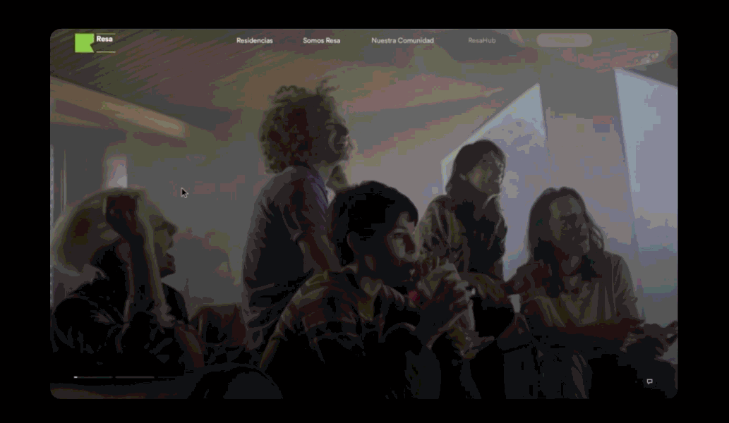
Visual Proposal
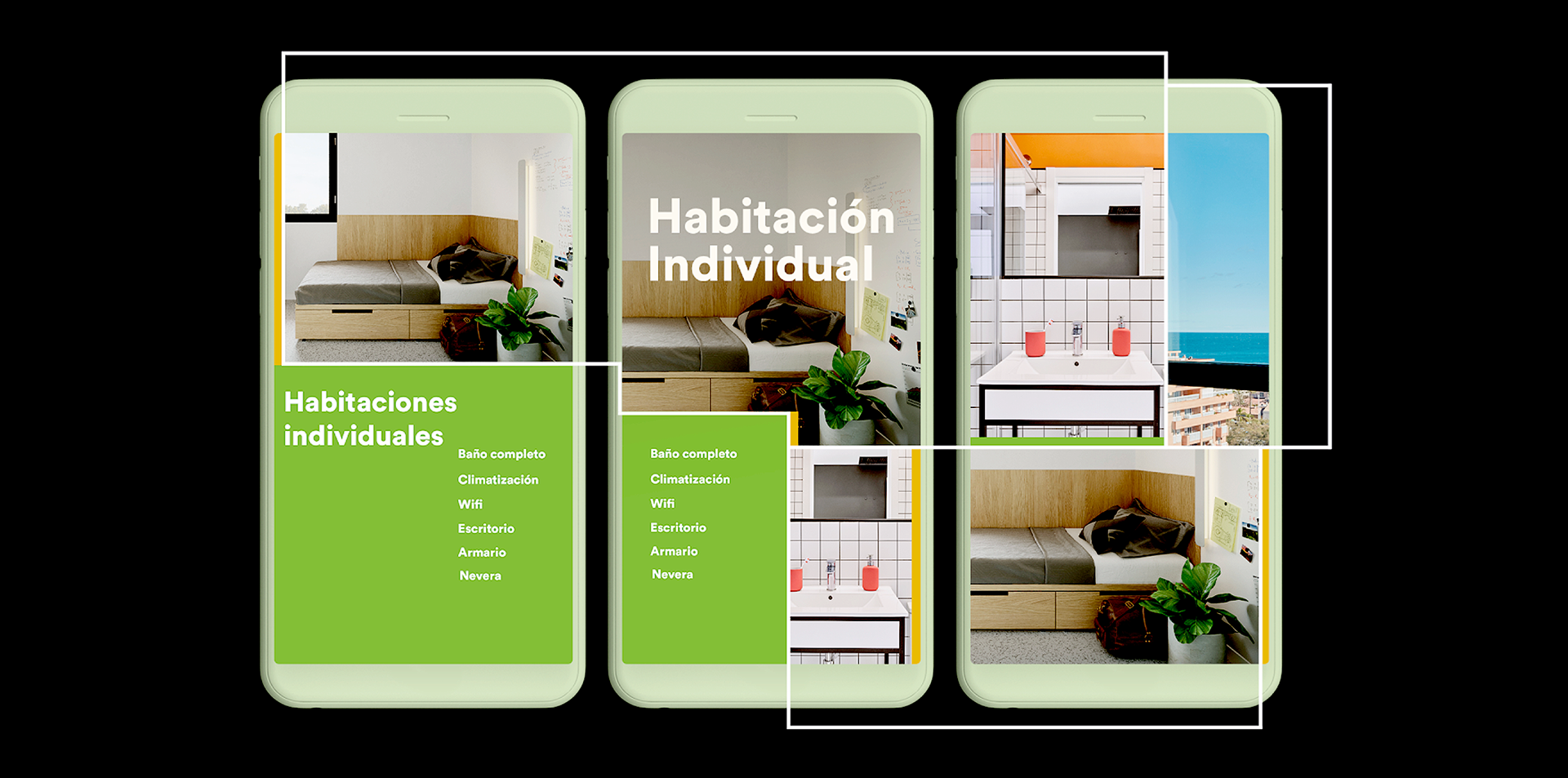
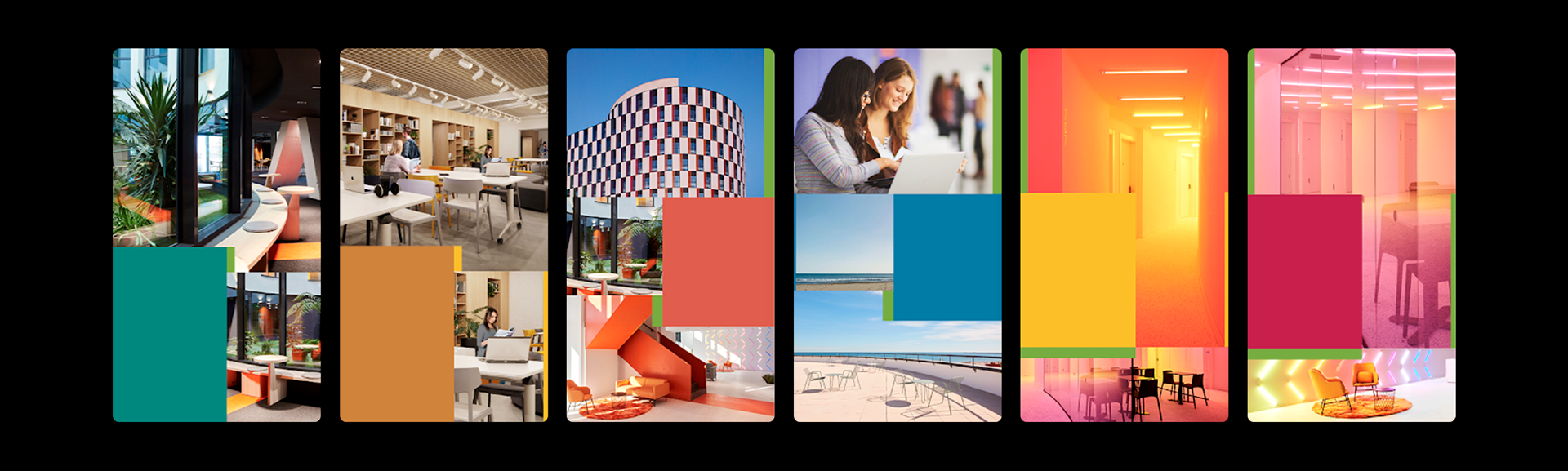
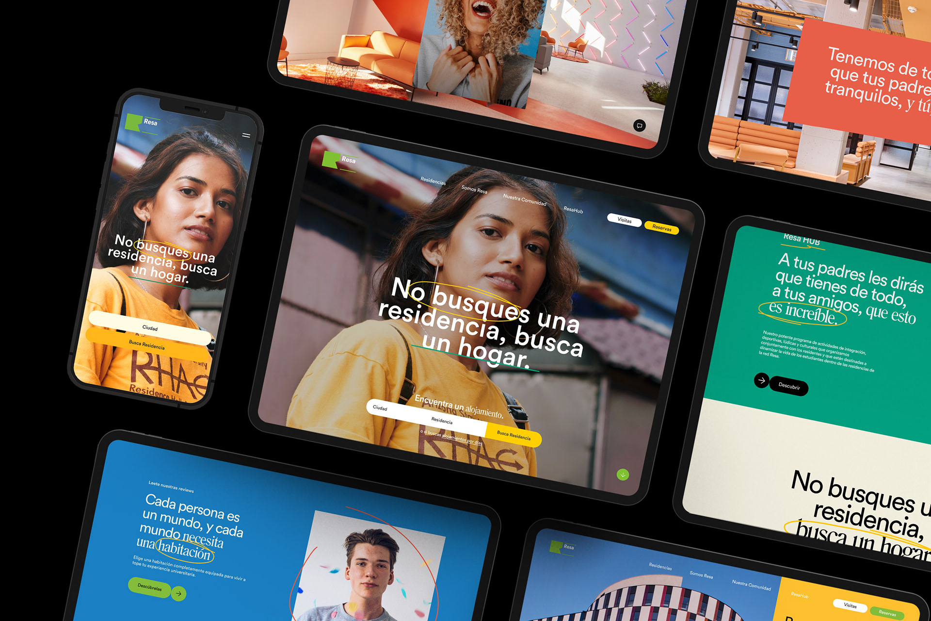
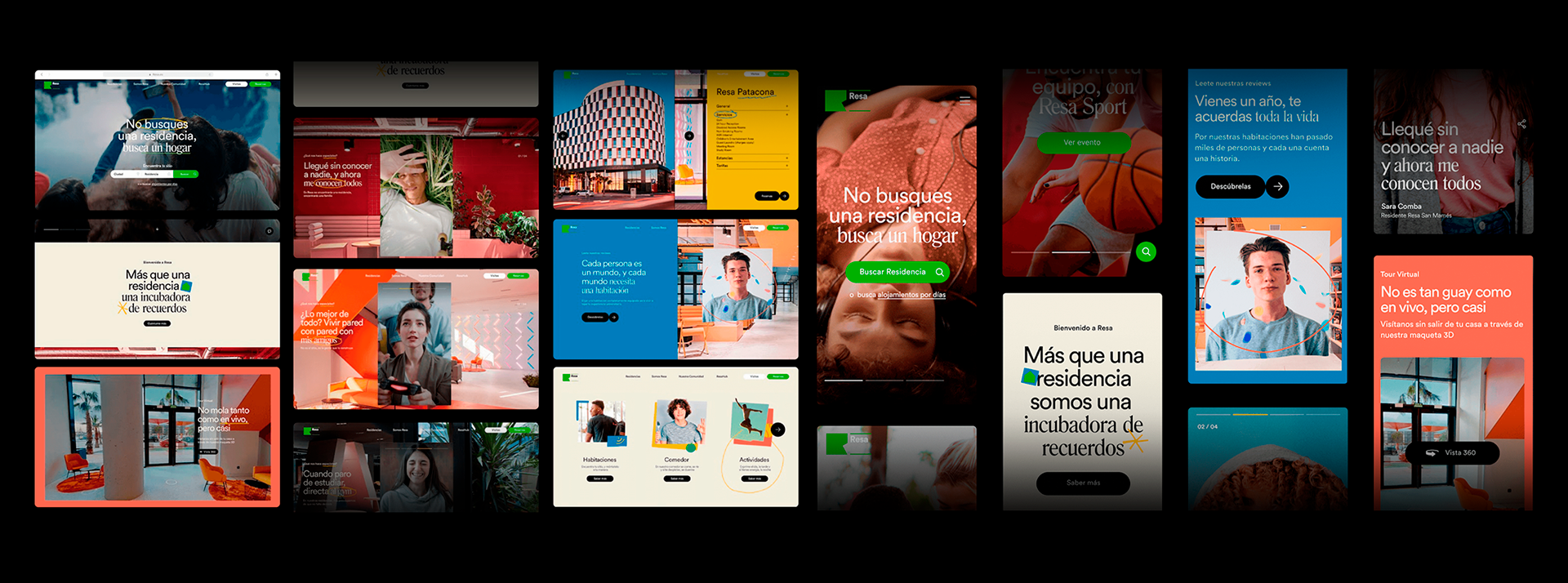
The design focuses on users, emphasizing values like warmth, trust, and modernity. We used the Circular font as the main typeface and Romana for standout titles, paired with RESA’s corporate green as the primary color. Casual, relatable photos and videos reinforce the emotional connection.
Interactive Features & Adaptive Design
We integrated animations and smooth transitions to enrich the experience, including parallax effects and interactive buttons (CTAs). These features create a dynamic and memorable navigation experience for users.
The design is optimized for both desktop and mobile, ensuring accessibility and a consistent experience across all devices. Visual elements and interactive components strengthen communication and connection with students.
Our main goal is to redefine how RESA connects with its audiences. This includes creating closer verbal and visual communication, unique storytelling, and an emotionally resonant identity. By doing so, we aim to optimize the user experience and improve business outcomes.
Creative Idea & Storytelling
University life represents a time of change and mixed emotions. RESA is more than just a residence—it’s a safe place to grow as a person and be part of a community. This concept is the guiding principle behind the entire project.
We adopted a first-person voice to build an authentic connection with the user. The messages are clear, emotional, and direct, always with a clever twist that invites engagement. This approach aims to foster a friendly, conversational relationship while moving away from traditional corporate communication.
Visual Proposal
The design focuses on users, emphasizing values like warmth, trust, and modernity. We used the Circular font as the main typeface and Romana for standout titles, paired with RESA’s corporate green as the primary color. Casual, relatable photos and videos reinforce the emotional connection.
Interactive Features & Adaptive Design
We integrated animations and smooth transitions to enrich the experience, including parallax effects and interactive buttons (CTAs). These features create a dynamic and memorable navigation experience for users.
The design is optimized for both desktop and mobile, ensuring accessibility and a consistent experience across all devices. Visual elements and interactive components strengthen communication and connection with students.